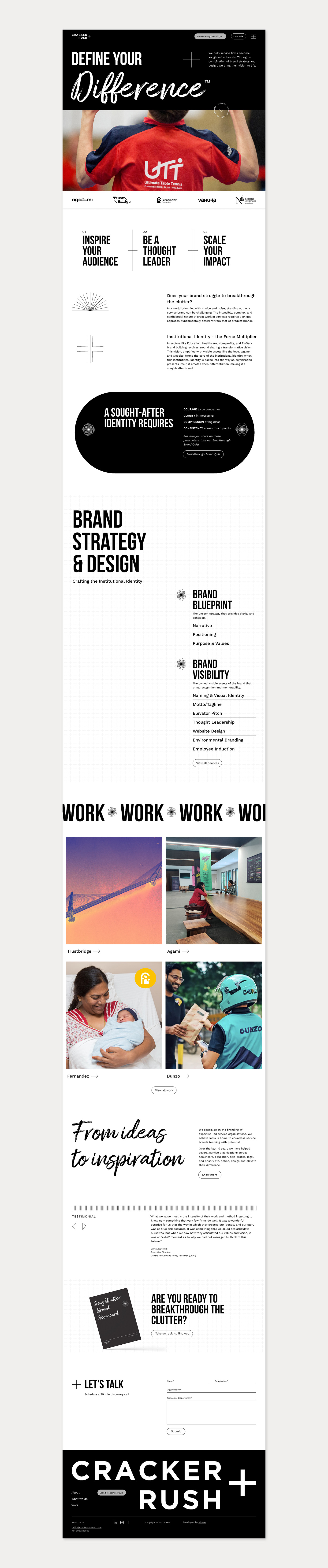
Our previous website, created approximately 8 years ago, had become outdated and failed to effectively convey our unique perspective on branding. Recognising the prevalent confusion within the cluttered branding industry, we undertook a comprehensive overhaul to not only refresh the design but also restructure our narrative. Our goal was to provide clarity in an industry where understanding the essence of branding can be challenging.
To address the widespread confusion, we strategically incorporated interactive elements such as forms, quizzes, and webinars. These tools serve as dynamic avenues for clients to gain insights into branding, understand their specific requirements, and familiarize themselves with Cracker and Rush—all without the need for direct communication.
The shortcomings of the old design were evident in its lack of responsiveness and the absence of a component-based approach. Although mobile-friendly, it fell short of being truly 'mobile-first.' The content, while informative, was dense and not easily scannable. In response, we revamped our approach, ensuring a seamless user experience for our refined target audience—mid-sized service firms that are successful businesses but not yet recognized as major brands.
Our narrative was sharpened to effectively communicate with this specific audience segment. Simultaneously, we strategically showcased projects that align with the profile of our ideal clients, reinforcing our understanding of their needs and aspirations. The revamped website now reflects our commitment to accessibility, user engagement, and a clear articulation of the value we bring to mid-sized service firms on their journey towards building a significant brand presence.